Exporting Vis From Widget
In this tutorial, we will first look at how you can access and export a single visualizations in the widget as code to further work with in the notebook. Then, we walk through how you can export more than one visualizations in the widget as an interactive report for sharing or presentation.
import pandas as pd
import lux
df = pd.read_csv("https://raw.githubusercontent.com/lux-org/lux-datasets/master/data/hpi.csv")
df.default_display = "lux" # Set Lux as default display
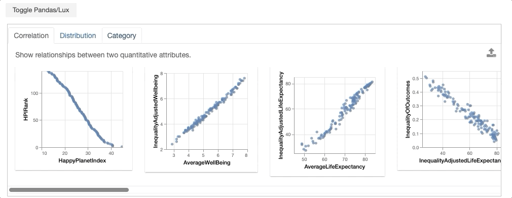
As an example, we load in the Happy Planet Index dataset, which contains metrics related to well-being for 140 countries around the world. Note that for the convienience of this tutorial, we set Lux as the default display so we don’t have to Toggle from the Pandas table display everytime we print the dataframe.
Working with a Single Visualizations from Widget
Selecting a Single Visualization as Vis
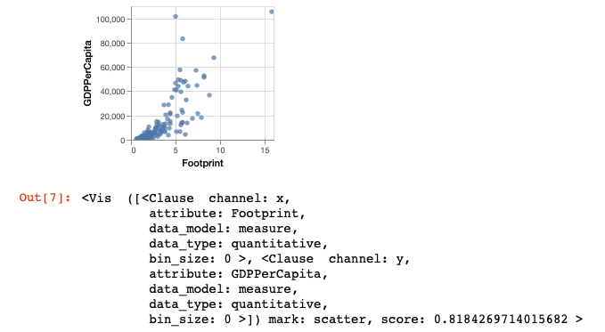
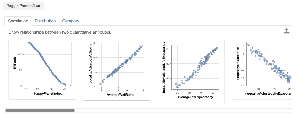
From the dataframe recommendations, the visualization showing the relationship between GDPPerCapita and Footprint is very interesting. In particular, there is an outlier with extremely high ecological footprint as well as high GDP per capita. So we click on this visualization and click on the export button.
df
vis = df.exported[0]
vis
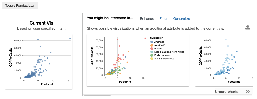
Setting Vis as the Updated Intent
Often, we might be interested in other visualizations that is related to a visualization of interest and want to learn more. With the exported Vis, we can update the intent associated with dataframe to be based on the selected Vis to get more recommendations related to this visualization.
df.intent = vis
df
Exporting Visualizations as Code
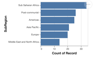
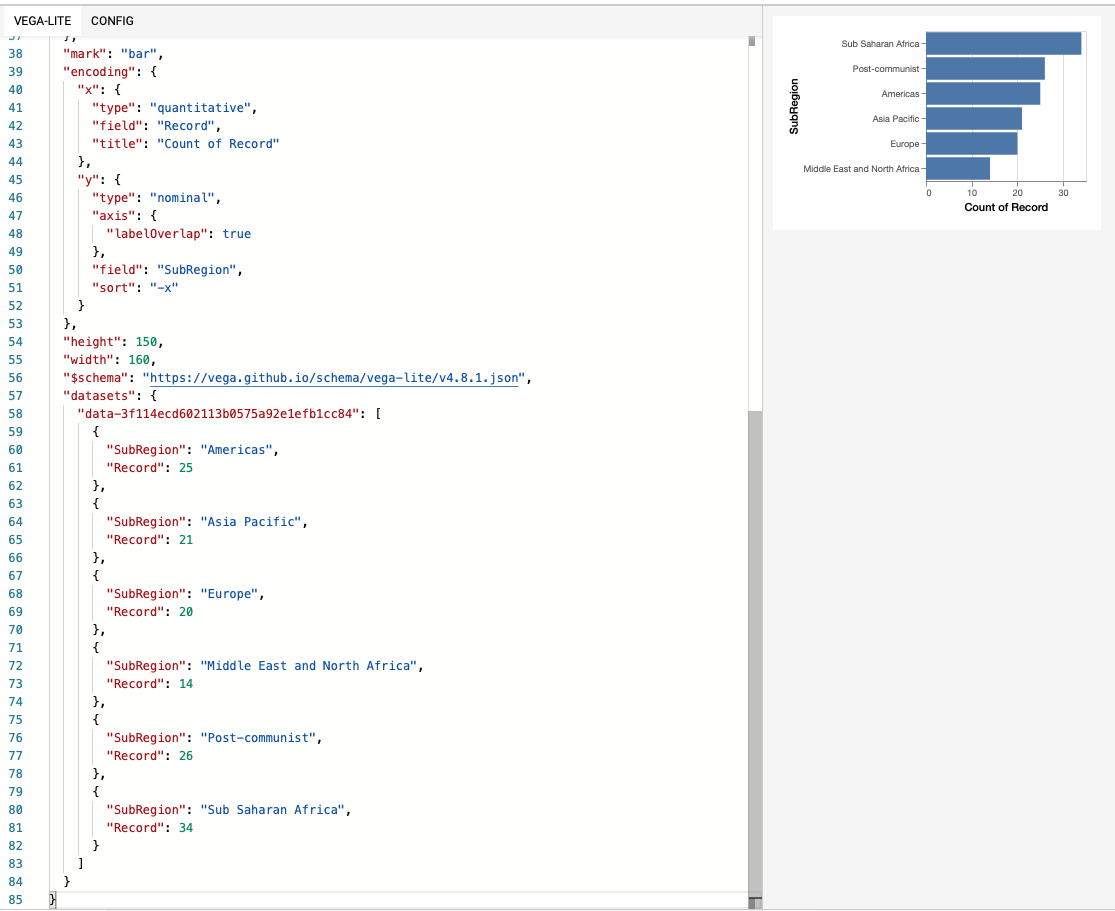
Looking at the Occurrence tab, we can select and export the bar chart distribution of SubRegion.
vis = df.exported[0]
vis
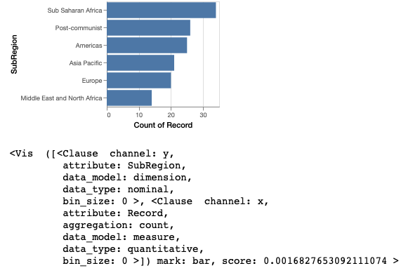
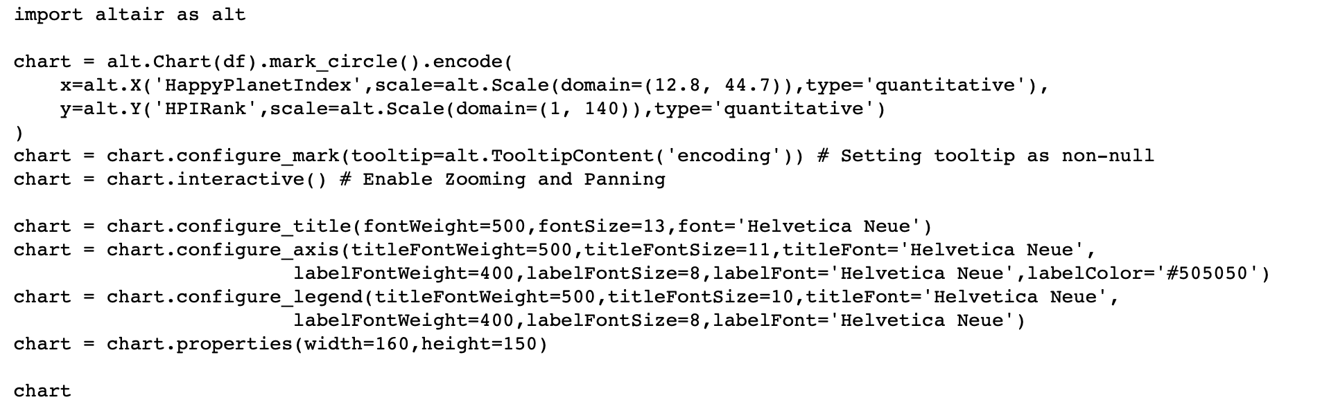
To allow further edits of visualizations, visualizations can be exported to code in Matplotlib, Altair, or as Vega-Lite specification via the to_code command:
print (vis.to_code("matplotlib"))
print (vis.to_code("altair"))
print (vis.to_code("vegalite"))
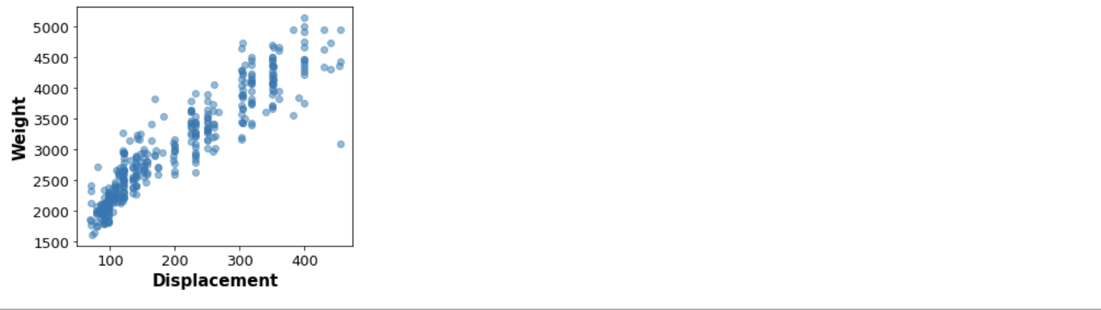
Exporting to Matplotlib
We can also export the visualization as code in Matplotlib.
print (vis.to_matplotlib())
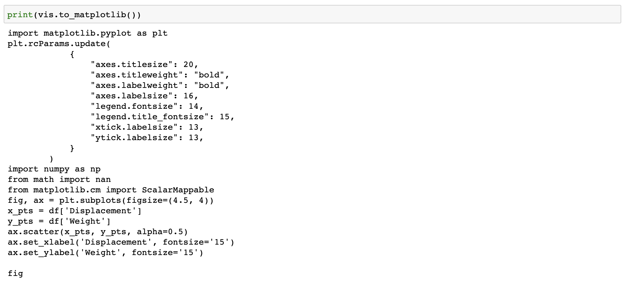
This code can be copy-and-pasted back into a new notebook cell for further editing.
import matplotlib.pyplot as plt
plt.rcParams.update(
            {
                "axes.titlesize": 20,
                "axes.titleweight": "bold",
                "axes.labelweight": "bold",
                "axes.labelsize": 16,
                "legend.fontsize": 14,
                "legend.title_fontsize": 15,
                "xtick.labelsize": 13,
                "ytick.labelsize": 13,
            }
        )
import numpy as np
from math import nan
from matplotlib.cm import ScalarMappable
fig, ax = plt.subplots(figsize=(4.5, 4))
x_pts = df['Displacement']
y_pts = df['Weight']
ax.scatter(x_pts, y_pts, alpha=0.5)
ax.set_xlabel('Displacement', fontsize='15')
ax.set_ylabel('Weight', fontsize='15')

fig
Exporting to Altair
print (vis.to_altair())
import altair as alt
visData = pd.DataFrame({'SubRegion': {0: 'Americas', 1: 'Asia Pacific', 2: 'Europe', 3: 'Middle East and North Africa', 4: 'Post-communist', 5: 'Sub Saharan Africa'}, 'Record': {0: 25, 1: 21, 2: 20, 3: 14, 4: 26, 5: 34}})

chart = alt.Chart(visData).mark_bar().encode(
    y = alt.Y('SubRegion', type= 'nominal', axis=alt.Axis(labelOverlap=True), sort ='-x'),
    x = alt.X('Record', type= 'quantitative', title='Count of Record'),
)
chart = chart.configure_mark(tooltip=alt.TooltipContent('encoding')) # Setting tooltip as non-null
chart = chart.configure_title(fontWeight=500,fontSize=13,font='Helvetica Neue')
chart = chart.configure_axis(titleFontWeight=500,titleFontSize=11,titleFont='Helvetica Neue',
            labelFontWeight=400,labelFontSize=8,labelFont='Helvetica Neue',labelColor='#505050')
chart = chart.configure_legend(titleFontWeight=500,titleFontSize=10,titleFont='Helvetica Neue',
            labelFontWeight=400,labelFontSize=8,labelFont='Helvetica Neue')
chart = chart.properties(width=160,height=150)
chart
Exporting to Vega-Lite
You can also export this as Vega-Lite specification and view/edit the specification on Vega Editor.
print (vis.to_vegalite())
Exporting Standalone Visualization Code
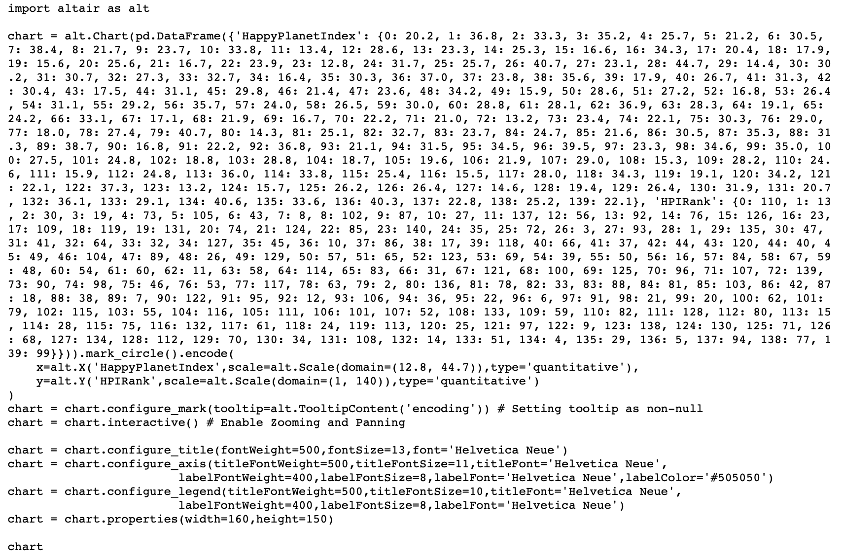
Let’s say now we are interested in the scatter plot of the HPIRank and HappyPlanetIndex.
vis = df.recommendation["Correlation"][0]
Since the dataset used to create the scatterplot is large, Lux infers the variable name used locally for the data, and uses that as the data in the printed code block.
print (vis.to_altair())
If we wanted to include the actual data in the returned codeblock, we would use to_altair(standalone=True) to create a code snippet that contains all the data that we need embedded in the code itself, which can be run outside the notebook.
print (vis.to_altair(standalone=True))
Working with Multiple Visualizations from Widget
We have seen how you can select and export a single visualization of interest. Now let’s say that we found several visualizations that displays interesting trends to filter to and investigate further.
Selecting Multiple Visualization as VisList
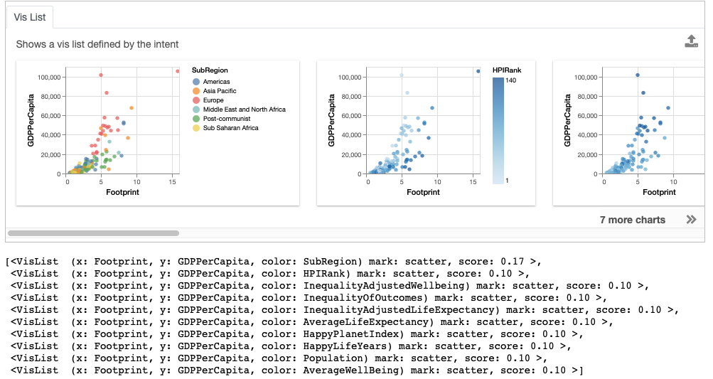
To do this, we can select one or more visualizations of interest and click on the export button to extract the selected visualizations into a separate widget for further processing.
After clicking on the export button, the selected visualizations are stored inside the exported property of the dataframe as a VisList, which can be accessed programmatically.
bookmarked_charts = df.exported
bookmarked_charts
![add screenshot of exported VisList (include the Out[] __repr__ string) in screenshot](../../_images/export-2.png)
Accessing Widget Recommendations
We can access the set of recommendations generated for the dataframes via the dataframe property recommendation.
df.recommendation
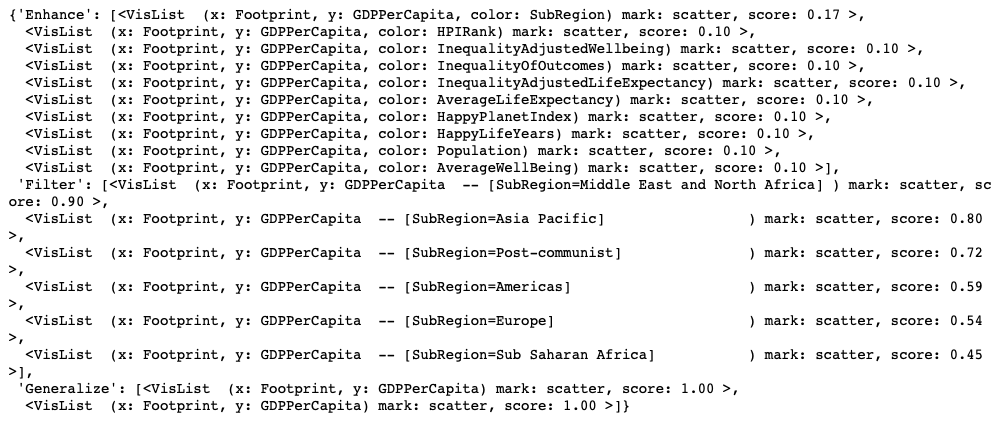
The resulting output is a Python dictionary, with the key as the name of the recommendation category and values as a VisList of recommendations.
df.recommendation["Enhance"]
Exporting Entire Dataframe Widgets
Let’s say that you are interested in export all the visualizations recommended by Lux, you can export the dataframe widget to an interactive HTML report or data application to share with others. By integrating Lux with DataPane, Panel or Streamlit, you can intersperse Markdown text, images, and other rich graphics and widgets, alongside the output widget generated by Lux to compose and author your own data science narrative.
Exporting to HTML Report
You can export the visualizations into a static HTML using the following command:
df.save_as_html()
By default, the file is saved as export.html, you can optionally specify the HTML filename in the input parameter.
df.save_as_html('hpi.html')
If you would like to output HTML be returned directly via save_as_html, you can input the parameter output=True.
html_content = df.save_as_html(output=True)
The HTML export functionality is the basis for exporting to interactive data apps, described next.
Exporting to DataPane
DataPane is a Python library used for creating interactive data science reports. To integrate Lux with a DataPane report, you can wrap the HTML widget output with a dp.HTML block as shown below:
import pandas as pd
import datapane as dp
import lux
df = pd.read_csv("https://raw.githubusercontent.com/lux-org/lux-datasets/master/data/hpi.csv")
html_content = df.save_as_html(output=True)
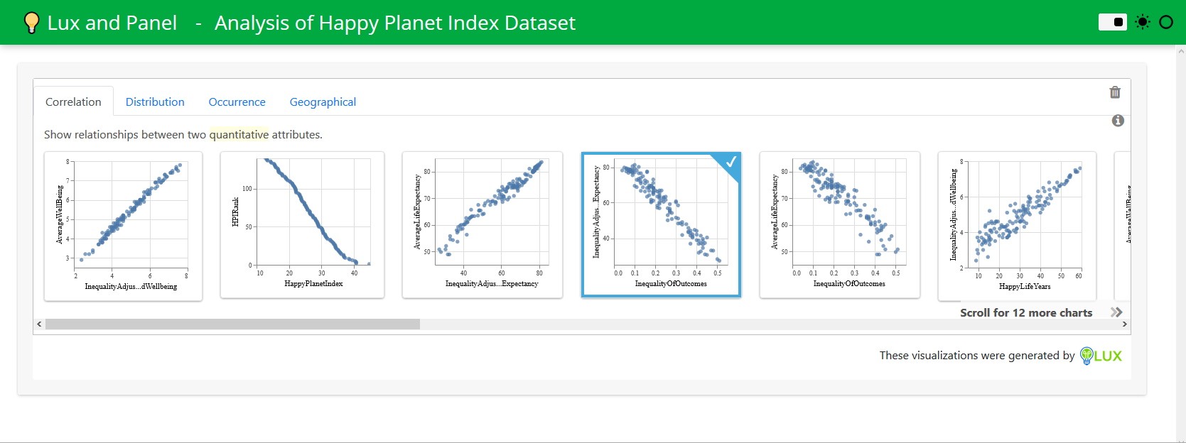
dp.Report("## Analysis of Happy Planet Index Dataset\n Check out these cool visualizations!",
dp.HTML(html_content)
).save(path='report.html', open=True)
You should find that a webpage report.html that pops up automatically.

Exporting to Panel
Panel is a powerful Python library for interactive data exploration and data apps. To integrate Lux with Panel, you can wrap the HTML widget output with a panel.pane.HTML pane as shown below:
import html

import pandas as pd
import panel as pn
import lux

pn.extension(sizing_mode="stretch_width")

df = pd.read_csv("https://raw.githubusercontent.com/lux-org/lux-datasets/master/data/hpi.csv")

def save_as_iframe(df, style="width:100%;height:100%", frameborder="0"):
    html_content = df.save_as_html(output=True)
    html_content = html.escape(html_content)
    return f"""<iframe srcdoc="{html_content}" style={style} frameborder="{frameborder}"
"allowfullscreen></iframe>"""

lux_iframe_report = save_as_iframe(df)

# Can display in notebook
lux_panel = pn.pane.HTML(lux_iframe_report, height=425)

# Can display as app with panel serve
pn.template.FastListTemplate(site="💡 Lux and Panel", title="Analysis of Happy Planet Index Dataset", main=[lux_panel]).servable();
After running panel serve app.ipynb or panel serve app.py in the command line, you should find the Panel app hosted in your browser (e.g., http://localhost:5006/app):
Exporting to Streamlit
Streamlit is a Python library that simplifies the process of creating interactive data apps that can be shared and deployed anywhere.
To integrate Lux with Streamlit, you can wrap the HTML widget output with a Streamlit Component. As shown below, you can create a file called app.py:
import streamlit as st
import streamlit.components.v1 as components
from pathlib import Path
import pandas as pd
import lux

def app():
    st.title('Analysis of Happy Planet Index Dataset')
    st.write('Check out these cool visualizations!')
    df = pd.read_csv("https://raw.githubusercontent.com/lux-org/lux-datasets/master/data/hpi.csv")
    export_file = 'visualizations.html'
    html_content = df.save_as_html(output=True)
    components.html(html_content, width=800, height=350)

app()
After running streamlit run app.py in the command line, you should find the Streamlit app hosted in your browser (e.g., localhost:8501):
