Exporting Vis From Widget
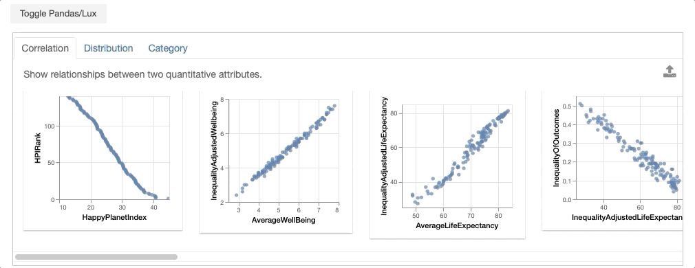
In this tutorial, we look at the Happy Planet Index dataset, which contains metrics related to well-being for 140 countries around the world. We demonstrate how you can select visualizations of interest and export them for further analysis.
import pandas as pd
import lux
df = pd.read_csv("lux/data/hpi.csv")
df.default_display = "lux" # Set Lux as default display
Note that for the convienience of this tutorial, we have set Lux as the default display so we don’t have to Toggle from the Pandas table display everytime we print the dataframe.
Exporting widget visualizations as static HTML
Let’s say that you are interested in sharing the visualizations displayed in Lux with others, you can export the visualizations into a static HTML using the following command:
df.save_as_html()
By default, the file is saved as export.html, you can optionally specify the HTML filename in the input parameter.
df.save_as_html('hpi.html')
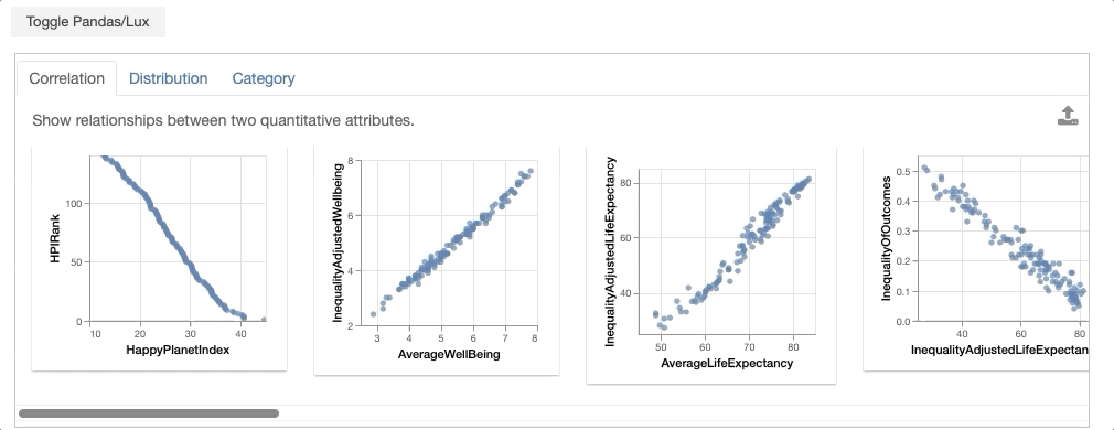
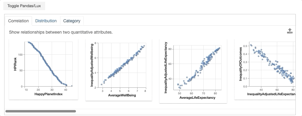
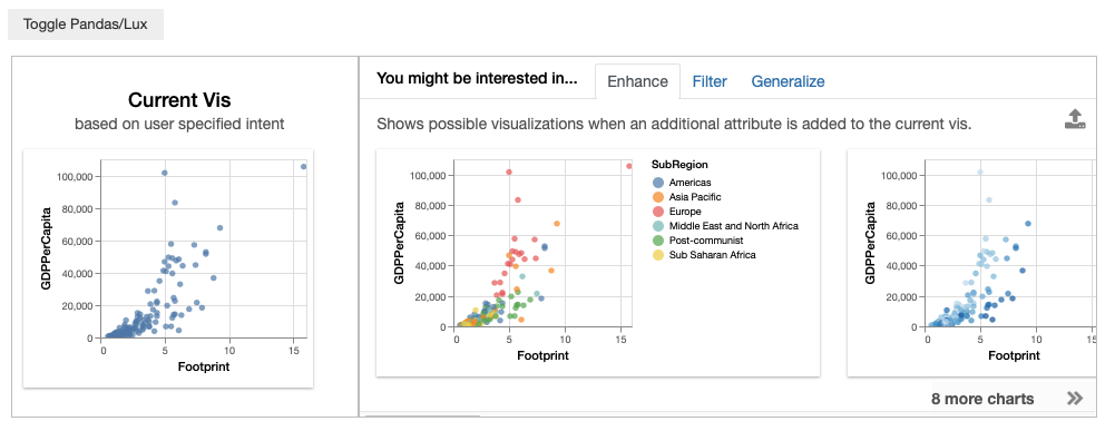
Selecting visualizations from recommendation widget
You can also click on visualizations of interest and export them into a separate widget for further processing.
df
bookmarked_charts = df.exported
bookmarked_charts
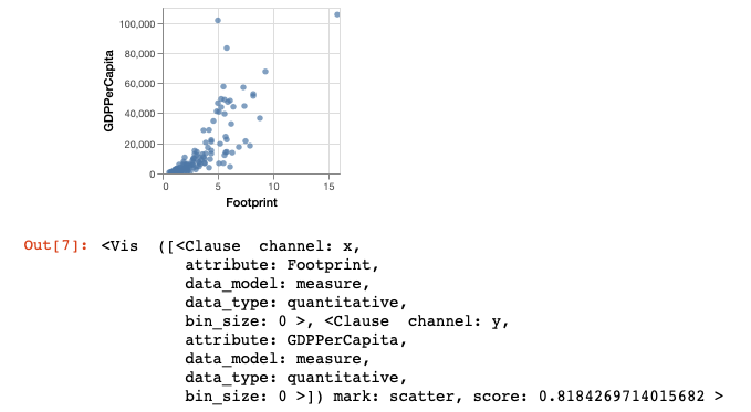
![add screenshot of exported VisList (include the Out[] __repr__ string) in screenshot](../../_images/export-2.png)
From the dataframe recommendations, the visualization showing the relationship between GDPPerCapita and Footprint is very interesting. In particular, there is an outlier with extremely high ecological footprint as well as high GDP per capita. So we click on this visualization and click on the export button.
df
vis = df.exported[0]
vis
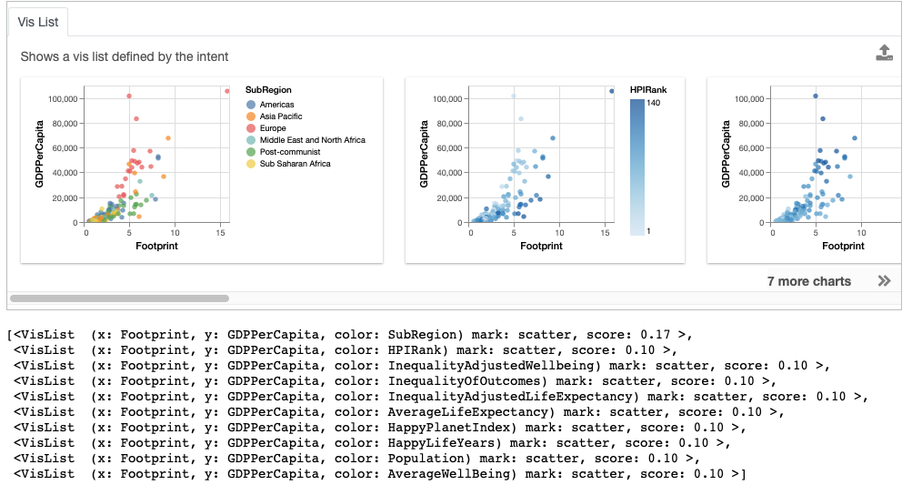
Setting Vis as the Updated Intent
Often, we might be interested in other visualizations that is related to a visualization of interest and want to learn more. With the exported Vis, we can update the intent associated with dataframe to be based on the selected Vis to get more recommendations related to this visualization.
df.intent = vis
df
Accessing Widget State
We can access the set of recommendations generated for the dataframes via the properties recommendation.
df.recommendation
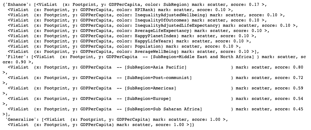
The resulting output is a dictionary, keyed by the name of the recommendation category.
df.recommendation["Enhance"]
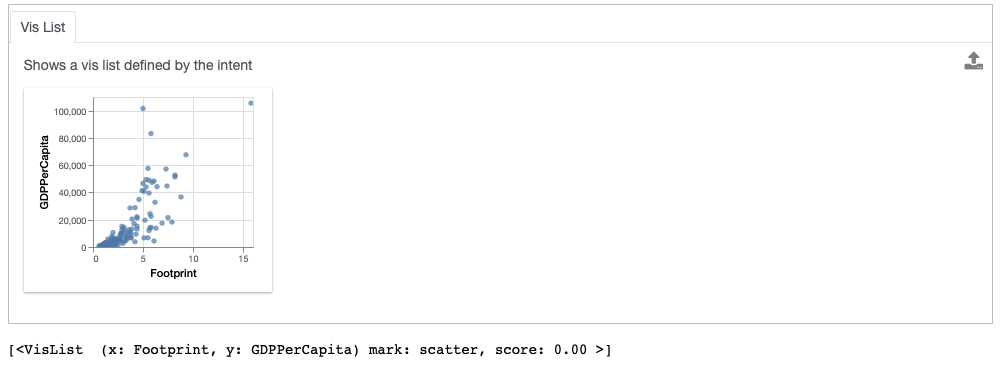
You can also access the vis represented by the current intent via the property current_vis.
df.current_vis
Exporting Visualizations as Code
Let’s revist our earlier recommendations by clearing the specified intent.
df.clear_intent()
df
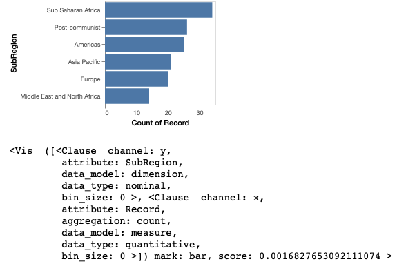
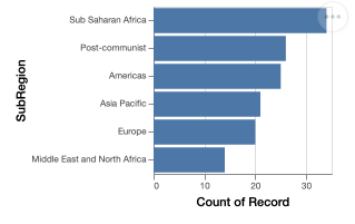
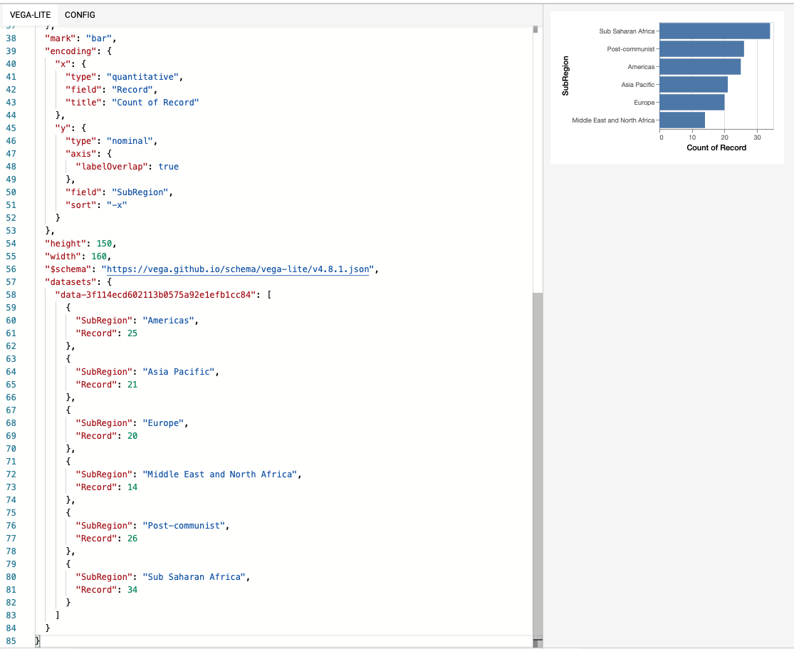
Looking at the Occurrence tab, we are interested in the bar chart distribution of country SubRegion.
vis = df.recommendation["Occurrence"][0]
vis
To allow further edits of visualizations, visualizations can be exported to code in Matplotlib, Altair, or as Vega-Lite specification via the to_code command:
print (vis.to_code("matplotlib"))
print (vis.to_code("altair"))
print (vis.to_code("vegalite"))
Exporting Visualizations to Matplotlib
We can also export the visualization as code in Matplotlib.
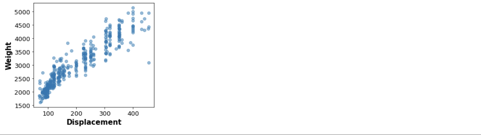
print (vis.to_matplotlib())
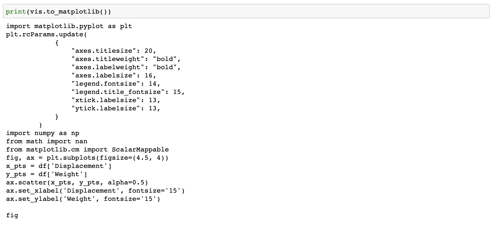
This code can be copy-and-pasted back into a new notebook cell for further editing.
import matplotlib.pyplot as plt
plt.rcParams.update(
            {
                "axes.titlesize": 20,
                "axes.titleweight": "bold",
                "axes.labelweight": "bold",
                "axes.labelsize": 16,
                "legend.fontsize": 14,
                "legend.title_fontsize": 15,
                "xtick.labelsize": 13,
                "ytick.labelsize": 13,
            }
        )
import numpy as np
from math import nan
from matplotlib.cm import ScalarMappable
fig, ax = plt.subplots(figsize=(4.5, 4))
x_pts = df['Displacement']
y_pts = df['Weight']
ax.scatter(x_pts, y_pts, alpha=0.5)
ax.set_xlabel('Displacement', fontsize='15')
ax.set_ylabel('Weight', fontsize='15')

fig
Exporting Visualizations to Altair
print (vis.to_altair())
import altair as alt
visData = pd.DataFrame({'SubRegion': {0: 'Americas', 1: 'Asia Pacific', 2: 'Europe', 3: 'Middle East and North Africa', 4: 'Post-communist', 5: 'Sub Saharan Africa'}, 'Record': {0: 25, 1: 21, 2: 20, 3: 14, 4: 26, 5: 34}})

chart = alt.Chart(visData).mark_bar().encode(
    y = alt.Y('SubRegion', type= 'nominal', axis=alt.Axis(labelOverlap=True), sort ='-x'),
    x = alt.X('Record', type= 'quantitative', title='Count of Record'),
)
chart = chart.configure_mark(tooltip=alt.TooltipContent('encoding')) # Setting tooltip as non-null
chart = chart.configure_title(fontWeight=500,fontSize=13,font='Helvetica Neue')
chart = chart.configure_axis(titleFontWeight=500,titleFontSize=11,titleFont='Helvetica Neue',
            labelFontWeight=400,labelFontSize=8,labelFont='Helvetica Neue',labelColor='#505050')
chart = chart.configure_legend(titleFontWeight=500,titleFontSize=10,titleFont='Helvetica Neue',
            labelFontWeight=400,labelFontSize=8,labelFont='Helvetica Neue')
chart = chart.properties(width=160,height=150)
chart
Exporting Visualizations to Vega-Lite
You can also export this as Vega-Lite specification and view/edit the specification on Vega Editor.
print (vis.to_vegalite())
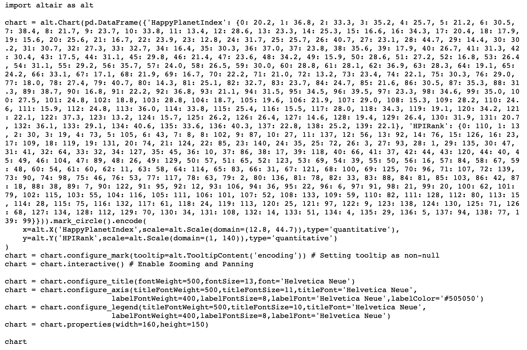
Exporting Standalone Visualizations
Let’s say now we are interested in the scatter plot of the HPIRank and HappyPlanetIndex.
vis = df.recommendation["Correlation"][0]
Since the dataset used to create the scatterplot is large, Lux infers the variable name used locally for the data, and uses that as the data in the printed code block.
print (vis.to_altair())
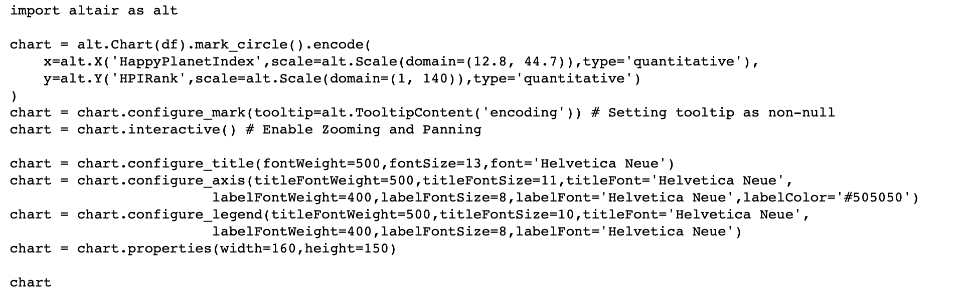
If we wanted to include the actual data in the returned codeblock, we would use to_altair(standalone=True) to create a code snippet that contains all the data that we need embedded in the code itself, which can be run outside the notebook.
print (vis.to_altair(standalone=True))